Sticking with an idea vs. Listening to players
During our months of developing Epicinium, we've noticed that we need to continually strike a balance between defying and meeting expectations. Games are an interactive medium. If a game goes against players' expectations at every turn, it becomes inaccessible: players will just become frustrated and stop playing. Especially in a multiplayer-focused game where you're trying to build a community, that's bad. On the other hand, if there's a strong vision behind the game, fulfilling all of the players' expectations will quickly cause your original vision to become buried, and you might end up with Clash of Whatever, part SomeRomanNumeral. We're not sure we've been entirely successful at striking that balance until now - we probably tend to err towards inaccessibility -, but we will illustrate this balance by giving some examples of common player feedback we've gotten, and how we've handled them.
No unit merging
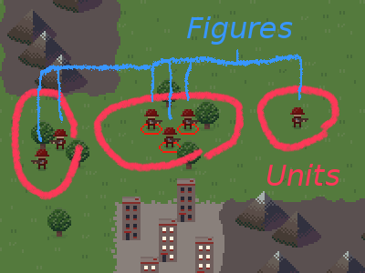
A very common reaction from players who are playing the tutorial is "why can't you merge units?". In Epicinium, players control units on a grid-based map, which consist of one or more figures. You can have a Rifleman unit with three figures, or a triple Rifleman, which might become a double Rifleman if one of the figures is killed in combat. Only one (ground) unit may occupy a single tile at a time. People have the expectation that you can merge these units, for example by moving a unit consisting of one lone Rifleman into a tile occupied by a double Rifleman, thereby combining to a triple Rifleman. This expectation is very natural, and stems from people's knowledge of how in real life, people can combine to form different groups, and perhaps from playing other strategy games where you can merge squads. However, if a player tries this in Epicinium, they are disappointed: the lone Rifleman will promptly stop moving one tile before reaching the other unit. Sorry!
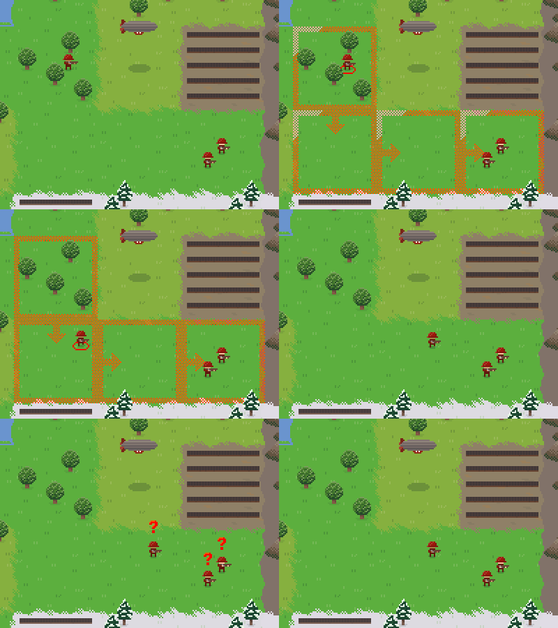
The reason we haven't implemented unit merging originates in how we designed our combat system. A triple Rifleman is much, much stronger than a single Rifleman, definitely more than three times as strong. They have more firepower (shooting three times in one encounter rather than once makes all the difference in a combat system without health bars), and higher survivability (incoming attacks are spread out among the figures, resulting in a much higher chance that none of the figures dies). Triple Rifleman units are basically a reward for the player's patience and endurance; they've managed to grow a City to three power, letting it survive three consecutive nights while resisting the temptation to utilize them for anything else that costs power. By contrast, a single Rifleman is only good for picking off straggler Settlers and doesn't stand a chance when fighting larger forces. Allowing the player to create a triple Rifleman by merging would allow them to create a very strong unit very early in the game, throwing off the investment-reward balance we had intended.
In this case we feel that in order to keep our vision of the game alive, we need to defy this particular player expectation. Nonetheless, it is very useful for us to learn that this expectation exists. Maybe it's a good idea to give this mechanic a try anyway. Maybe it's a design choice stemming from assumptions we had in the beginning that no longer apply today, and it's perfectly possible to implement merging and re-balance the game with some tweaks in other areas. At the same time, just because players expect it doesn't always entail that we should do it. But in that case, at least, we need to do something to address the expectation; explicitly mention the impossibility of merging early in the game, visually subvert the reason people make the assumption in the first place (as Advance Wars does, where squads of however many soldiers are represented on the map by a sprite of a single soldier), or have an in-game logic reason why merging is not allowed.
Selecting units and tiles
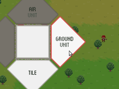
An example of where we did see the "errors of our ways", thanks to player feedback, is our selection mechanic. In Epicinium, a maximum of three selectable things can be on the same tile at once: a ground unit, an air unit and buildings. We used to have a system where, wanting to select anything, you would have to left-click anywhere on the tile, a selection menu would pop up and then you would have to click on the corresponding panel. We figured the player would have to do this even when there was only one thing to select, for else the selection menu would come as a surprise whenever it would inevitably come raging into the china shop another time. You would always have to go through this menu before giving any order, which was (and still is) performed though another menu, the order menu, which is brought up by right-clicking the selected unit or building. We quickly found out that players were utterly confused by this system. Still figuring out the controls and already a bit disconcerted by when to left- or right-click, they now had to keep apart two similar-looking menus produced by opposing mouse buttons before even able to give an order, the most basic mechanic in the game! We decided to retire this selection system in favour of the more intuitive figure-based ("click-on-what-you-want-to-select") selection system. (The original system can still be found under Selection Mode: Context Menu in the settings, in case you want to try it out.)
Displaying unit stats
One more example is the tile/unit stat boxes that now grace the left side of the screen. We had long held on to a design philosophy where all the necessary information could be gathered by the player by observing the game world. In fancy terms, this is called "diegetic UI". For example, the health and strength of a unit can be learned by counting its figures, the power of a City by counting its lit-up buildings, thus eliminating the need for extra, space-invading UI elements. However, we recently concluded that pursuing diegetic UI exclusively is just not desirable for a pixel-art strategy game. Eventually we would run out of ways to display new information. A unit's movement speed; the color of the figures' boots? The number of firing volleys in one encounter; the number of medals of their uniform? It would quickly become very cluttered visually, and players wouldn't know where to look for these things anyway. A player who filled in our feedback form rightfully claimed that "having information is key in any strategy". He desired access to all statistical details in the game. We agreed and added the stat boxes.
Rearranging orders
Sometimes it is not a matter of expectation versus vision, but just a matter of time. One feature that we have had requested multiple times is the ability to rearrange the orders on the order list, and to quickly revoke orders or stop old orders. This is something we intended to add since the game's original conception, but there was always something else a little higher on the priority list. Additionally, we feared that it would take a lot of engineering work to rewrite our delicate little interface engine to be able to handle elements being dragged around at the whims of The Player. We felt that all that work might not be worth it if the player can achieve the same goal without it; orders could already be rearranged by assigning them again in a different sequence. This mentality changed when we realized not enough players were actively thinking about the sequence in which they gave their orders; a lot of players were not even aware of its significance. That's why you can now drag around orders at will. Hooray!
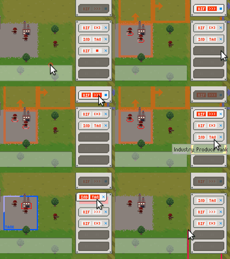
Most importantly, you can now rearrange orders in the new order list; that is, within the list of new orders that you have given in the current planning phase. You are not able to rearrange old orders, but you can drag old orders to the new order list to make sure they are executed after other ones. We also added little blue buttons; clicking the box-shaped button on an old order issues an Stop order that negates it, whereas clicking the x-shaped button on a new order removes it from the order list.
To help new players understand the importance of the order list, we have also disabled fog of war by default for human players. This makes it clear that the players alternate while executing their orders. It also makes it easier to see enemy attacks coming and respond in time, which might require rearranging some orders. AI opponents do not have global vision by default, and for competitive matches the fog of war can be reenabled.
Because it is no longer hidden knowledge which player goes first during the action phase, we have made this first player advantage visible to all players; the player colors indicate who goes first and who goes second, and this information is updated at the start of each planning phase.
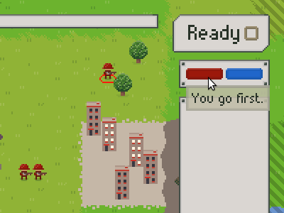
We do worry that the UI has become somewhat too large over time - both in on-screen size and in complexity -, so we may be making further changes in the future. Let us know what you think.
Files
Epicinium (Beta)
Turn-based strategy game where your impact on the environment matters
| Status | Released |
| Authors | A Bunch of Hacks, SLiV |
| Genre | Strategy |
| Tags | 2D, Destruction, environment, GitHub, Multiplayer, Pixel Art, Retro, Turn-based, Turn-based Strategy, War |
| Languages | English |
More posts
- Kickstarter dev match on Friday - more modes & strategiesNov 22, 2018
- Epicinium, on Kickstarter now: live Q&A tonight - unique environmental mechanicsNov 12, 2018
- Epicinium now live on Kickstarter!Nov 02, 2018
- Epicinium, environmental strategy game, is coming to KickstarterOct 19, 2018
- From Open Beta to Closed Beta + v0.29.0 releasedSep 21, 2018
- Version 0.28.2: Discord integration and UI improvementsSep 01, 2018
- New challenge in v0.27.0: Everything Is FreeAug 07, 2018
- Challenges arrive in v0.25.0Jul 07, 2018
- Balance changes in version 0.24.0Jun 01, 2018
- Beta 0.23.0: new Militia unit and other gameplay changesMay 26, 2018

Comments
Log in with itch.io to leave a comment.
Late to the party, but i like your choices so far.